Wednesday 31 January 2018
Wednesday 24 January 2018
Friday 19 January 2018
Friday 12 January 2018
Changing my poster
After asking my target audience I have decided to change my poster. My target audience pointed out that the image looks like the model is cold and it is not as natural as they'd hope. They also said that they would like to see less editing and that the shape does not really go. I have took into consideration what they have said and I have decided to start my poster again, using a more natural image and less editing.
Thursday 11 January 2018
Editing my poster
For my poster I wanted to include a geometric shape in the background, to create this tool to draw two shapes and then fit them on top of each other.

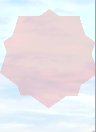
I then changed the colour of the shapes and lowered the opacity by selecting the layer and then lowering this:

I then added in a background by just using the sky of the image, this is then what it looked like:


I then outlined the model from the whole image like this:


I then changed the colour of the shapes and lowered the opacity by selecting the layer and then lowering this:
I then added in a background by just using the sky of the image, this is then what it looked like:
I then needed to cut out the model and put the image in front of the shape to do like I used the quick selection tool:
I then outlined the model from the whole image like this:

I then clicked on masks, then the first icon to the left and finally invert.

I then edited the edged of the image to make them look less harsh by going into mask edge and playing around with the sliders until I was happy with the image.

Finally I just added text and then found fonts that matched the theme then I was finished.
Friday 5 January 2018
Subscribe to:
Posts (Atom)